- DATE:
- AUTHOR:
- Cvent Product News Team

Plan & Promote Releases for October 7, 2026
Products covered under Plan & Promote are Registration, Abstract Management, Speaker Resource Center, Exhibitor Management, and Payments.
Registration
Navigation Updates: Collapsible Rail and Separated Search & Recent Items
Cvent's global navigation now gives you more control over your workspace. The navigation rail can be expanded or collapsed on demand, so you can keep it tucked away when you need more screen space and open it when you want quick access to labeled destinations. Search and Recent Items are also restored as two distinct entries, making it faster to find what you're looking for without combining two different workflows into one.
Key Things to Know
Collapsible navigation rail — The navigation rail now defaults to a collapsed state, showing only icons. Hover over the rail to reveal an expand icon; click it to pin the rail open with full labels. Click again to collapse it back.
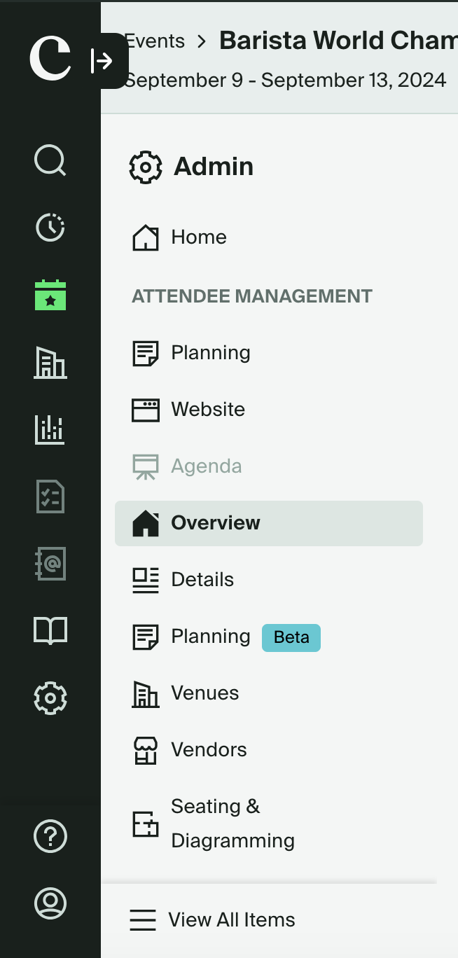
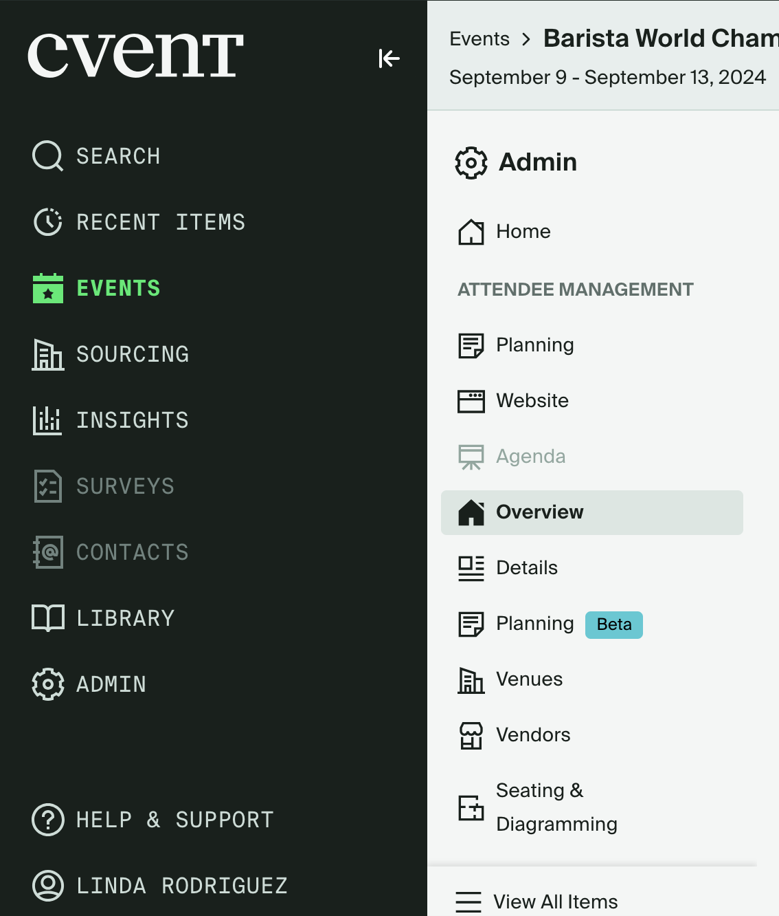
Icons remain functional while collapsed — When the rail is collapsed, hovering over any icon displays a flyout menu, so you can still navigate quickly without expanding the rail.
Consistent icon placement — Because the rail is always present (even when collapsed), icon positions stay consistent as you navigate between sections.
No section names have changed — All navigation destinations (Events, Sourcing, Insights, Reports, etc.) remain exactly as they were. This update only changes how the rail is displayed, not what's in it.
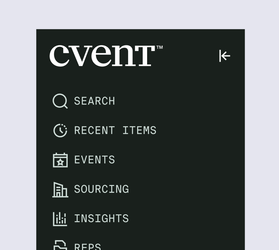
Search and Recent Items are now separate — A previous update combined Search and Recent Items into a single entry. These are now two distinct items in the navigation rail again, matching the original behavior.
Use Case Examples
The data-focused planner — A planner running reports across multiple events collapses the navigation rail to maximize their workspace, then hovers over the Insights icon to jump directly to their dashboard without fully expanding the nav.
The busy event coordinator — A coordinator switching rapidly between recent events clicks Recent Items directly in the rail — separate from Search — to pull up their last-visited event without having to type anything.
The new Cvent user — A planner still learning the platform expands the navigation rail to see full labels alongside every icon, giving them the context they need while they get oriented.
Website Agenda Widget Enhancements
We are excited to announce enhancements for the website agenda widget that will make it easier for our planners to deliver a personalized and flexible agenda experience to their attendees. The enhancements include:
Multilingual Tag support
With this release, planners can also use multilingual tags in the Website Agenda widget. Tag translations will automatically appear based on each attendee’s language preference, helping organizers deliver a more localized agenda experience across supported languages.
Increased filter limits
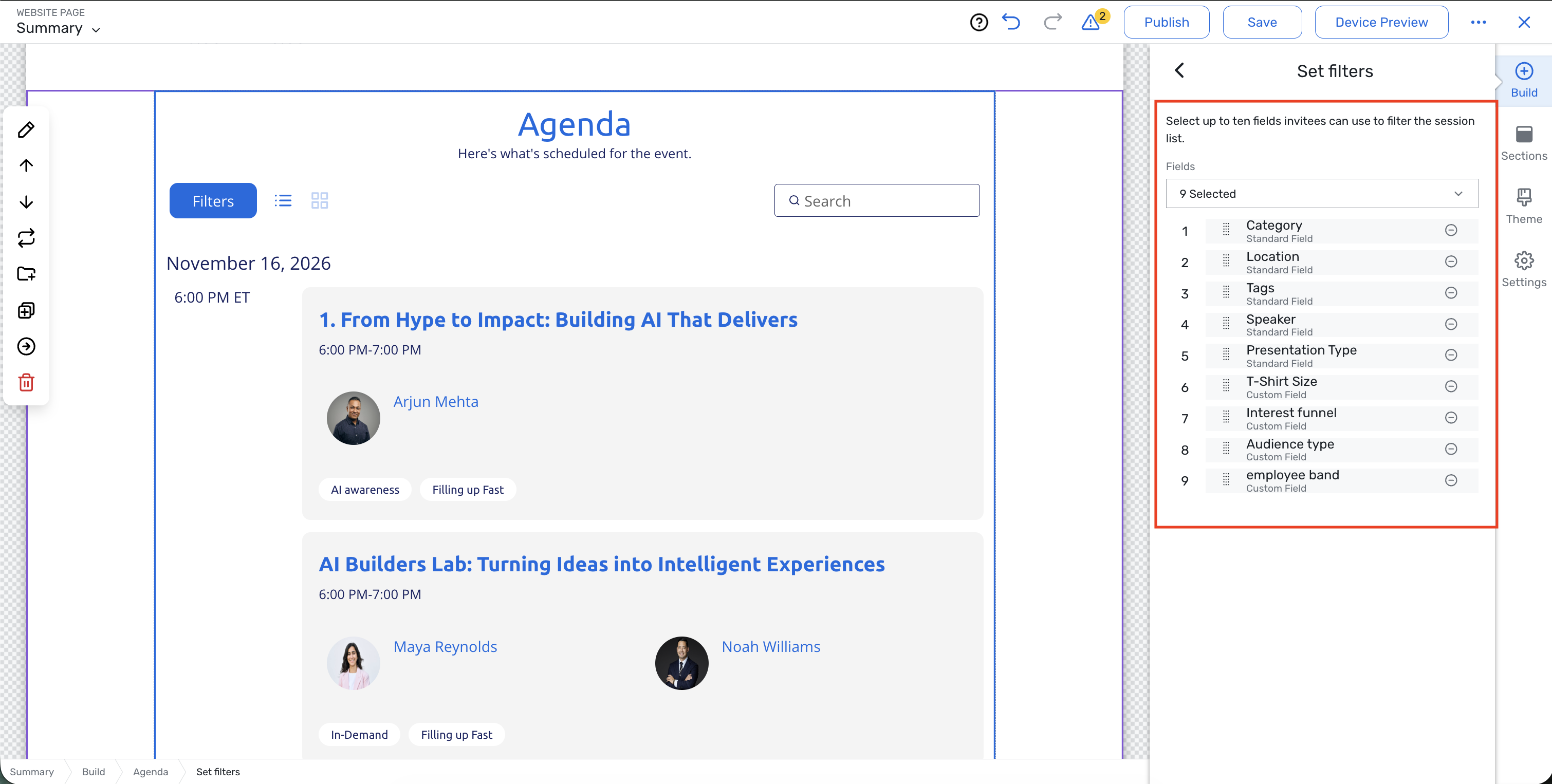
The agenda widget now supports up to 10 filter fields, up from the previous limit of 5. This gives organizers more flexibility to help attendees narrow down agenda content and find relevant sessions.
Planners can enable the tag translation experience by adding translations for tags in the Admin area.
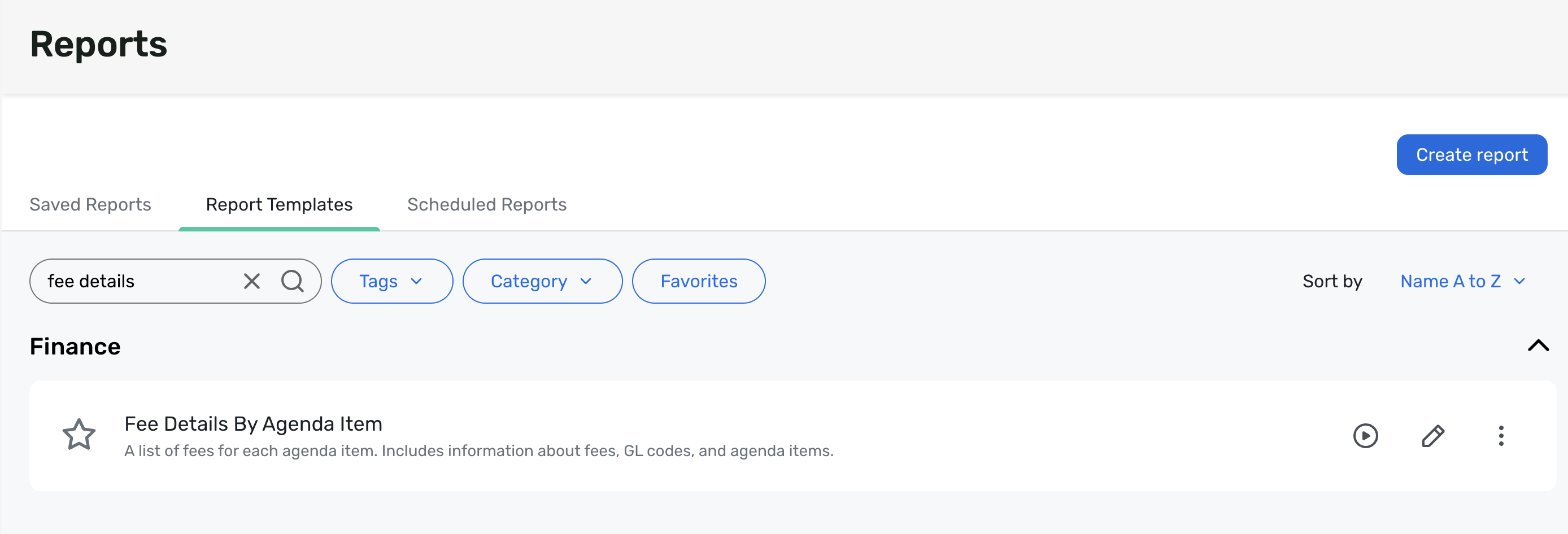
Fee Details by Agenda Item Report
Event organizers can use the new Fee Details by Agenda Item report to quickly review how Fees and General Ledger (GL) codes are set up across an event.
Planners can quickly review every event item that supports fees, confirm its associated GL code, and identify missing, incorrect, or misspelled codes before registration begins. GL codes must be configured before invitees register, so this report helps planners catch configuration issues early, when they can still be corrected.
Things to Know:
Go to Reports> Finance to find the report.
Access requires the Event Reports > Financial user permission.
Use Fee Details by Agenda Item report to scan fees by agenda item, with the fee, GL code, and agenda item details in one view.
Quickly verify the agenda item name, type and code, fee name, amount, status, creation date, associated registration types, and GL-code configuration.
Review GL code name, code, allocation percentage, and internal note details.
Every eligible item appears even when no GL code is assigned, so configuration gaps are easy to spot before they affect registration or downstream financial processes.
Supported item types include admission items, sessions, session bundles, quantity items, donation items, hotel items, taxes, and service fees.
Use the fee audit fields to see who created or last modified a fee and when.
The Fee Creation Date filter defaults to the previous 30 days but can be altered by editing the report defaults.
Fee-bearing agenda items now appear in the report criteria, making it easier to filter and validate them.
Service Fee and Tax rows now correctly show associated registration types when registration types are configured.
Registration Site Designer updates - Customize Panel
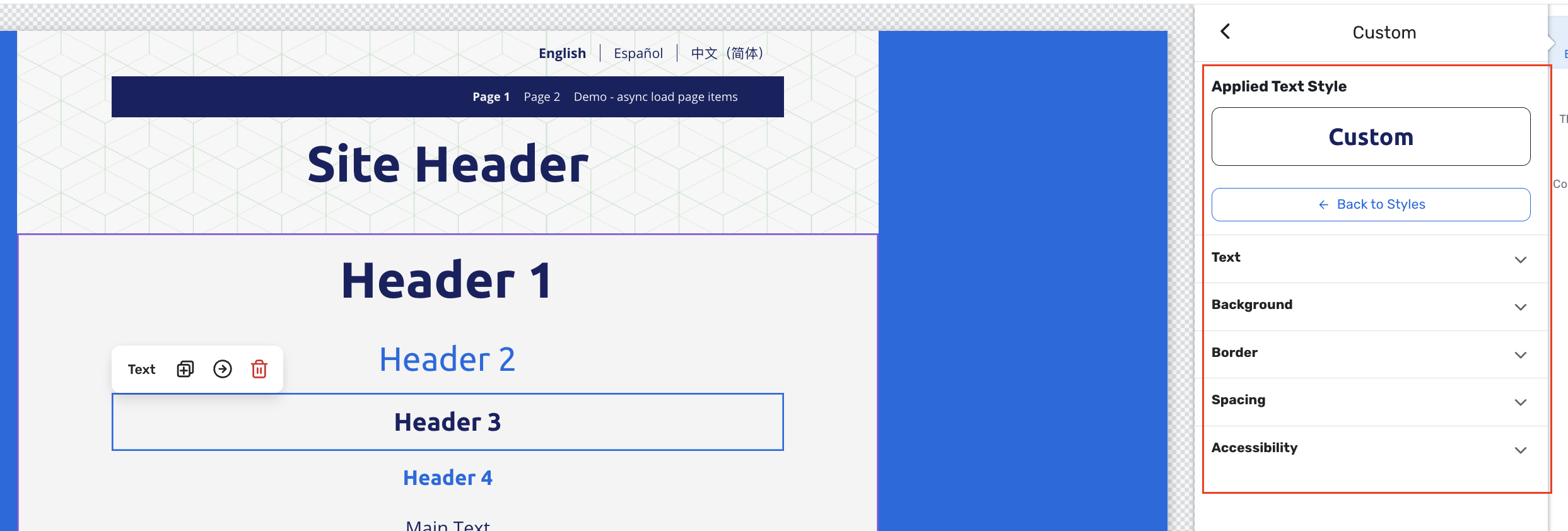
We’re updating the Customize panel in Event Site Designer to make styling widgets cleaner, more consistent, and easier to control. These changes focus on layout, naming, and visual refinements, plus one small new capability for linked spacing, so planners can quickly adjust backgrounds, borders, spacing, and text without wading through cluttered controls.
Why It Matters
Faster, clearer styling – Collapsible sections, renamed fields, and consistent color/number controls make it easier to find and adjust the settings you care about without guesswork.
More precise layouts – Linked vs individual spacing, plus numeric inputs for padding, borders, and font size, give you better control over alignment and balance.
Consistent theming workflow – Bringing background, border, text, and accessibility controls into a cleaner Customize experience helps the designer feel unified across widgets, sections, and theme settings.
What’s New:
Cleaner, collapsible sections
The Customize panel is now broken into clear sections (for example, Background, Border, Spacing, Text, Accessibility), each with a bolder header and collapsible behavior.
This reduces scrolling and visual noise, while making it easier to scan for the setting you need.
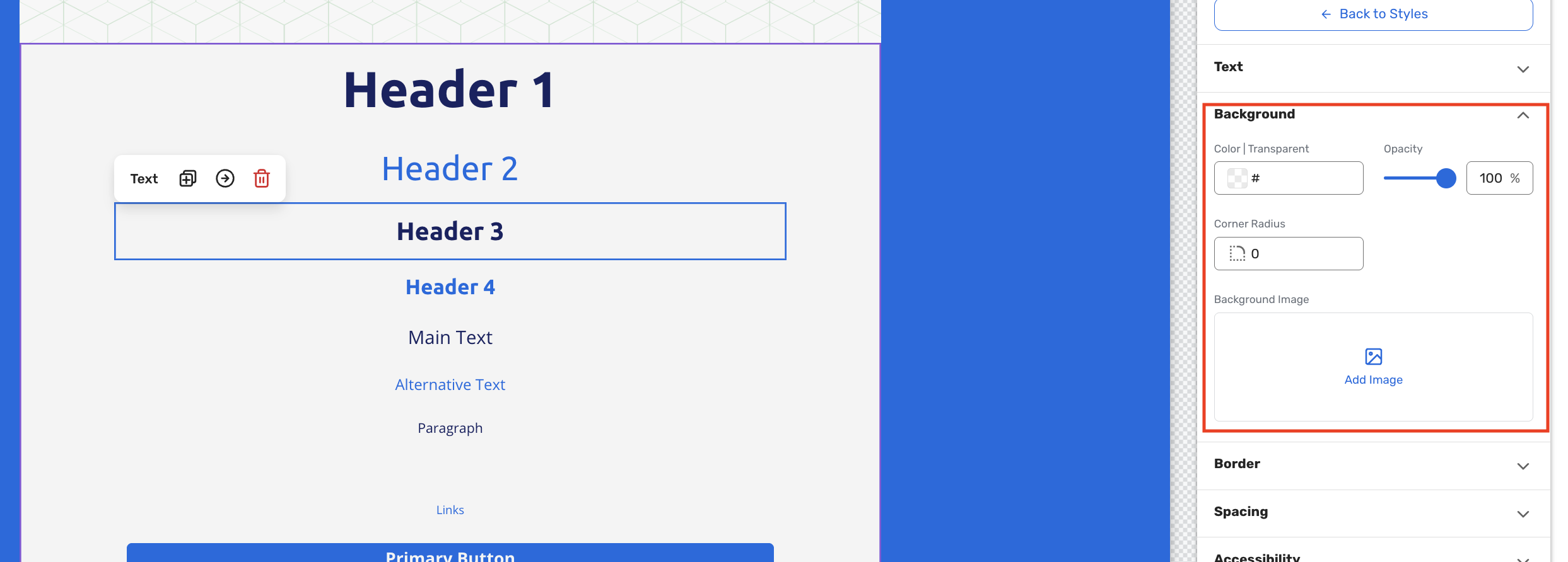
Background controls
Under Background, we’ve streamlined the controls and aligned them with our newer design patterns:
Color uses the updated Carina v2 color picker, with theme swatches and a compact opacity slider that now shows values as a percentage (0–100%).
Image (renamed from “Background Image”) clearly groups all image‑related controls, including image name, “Edit Image,” “Save As,” and options like scale, repeat, and alignment, under one header.
Corner Radius (renamed from “Rounded Corners”) now uses an icon‑based numeric control instead of a slider, matching other modern inputs in the designer.
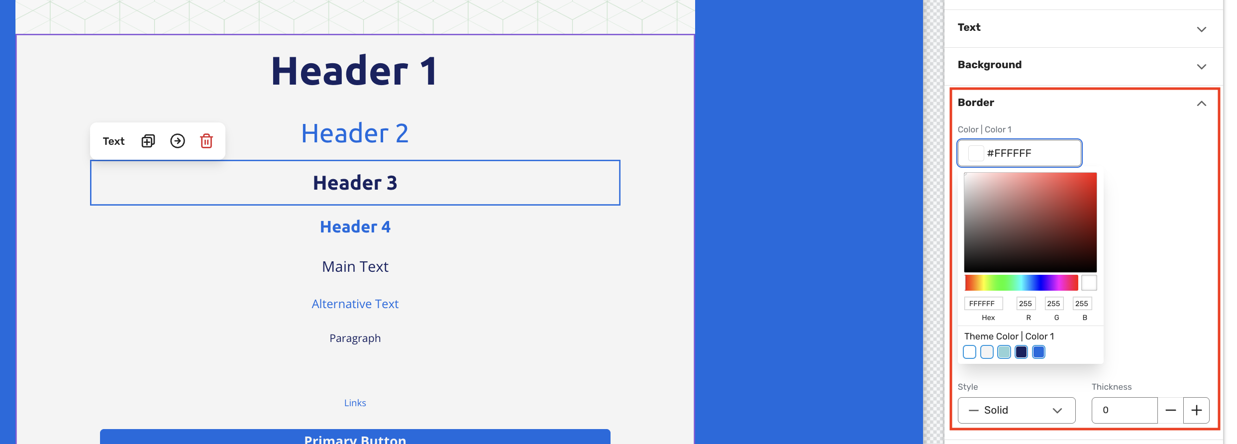
Border controls
The Border section has been simplified and made more intuitive:
Color uses the new color picker for consistency.
Style (renamed from “Outline”) now shows icons for solid and dashed styles in the dropdown, so the visual difference is obvious at a glance.
Thickness sits next to Style and uses a numeric selector with plus/minus controls (min 0, max 100) instead of a slider for more precise control.
Linked spacing vs individual spacing
The Spacing section has been redesigned to be both more powerful and easier to read:
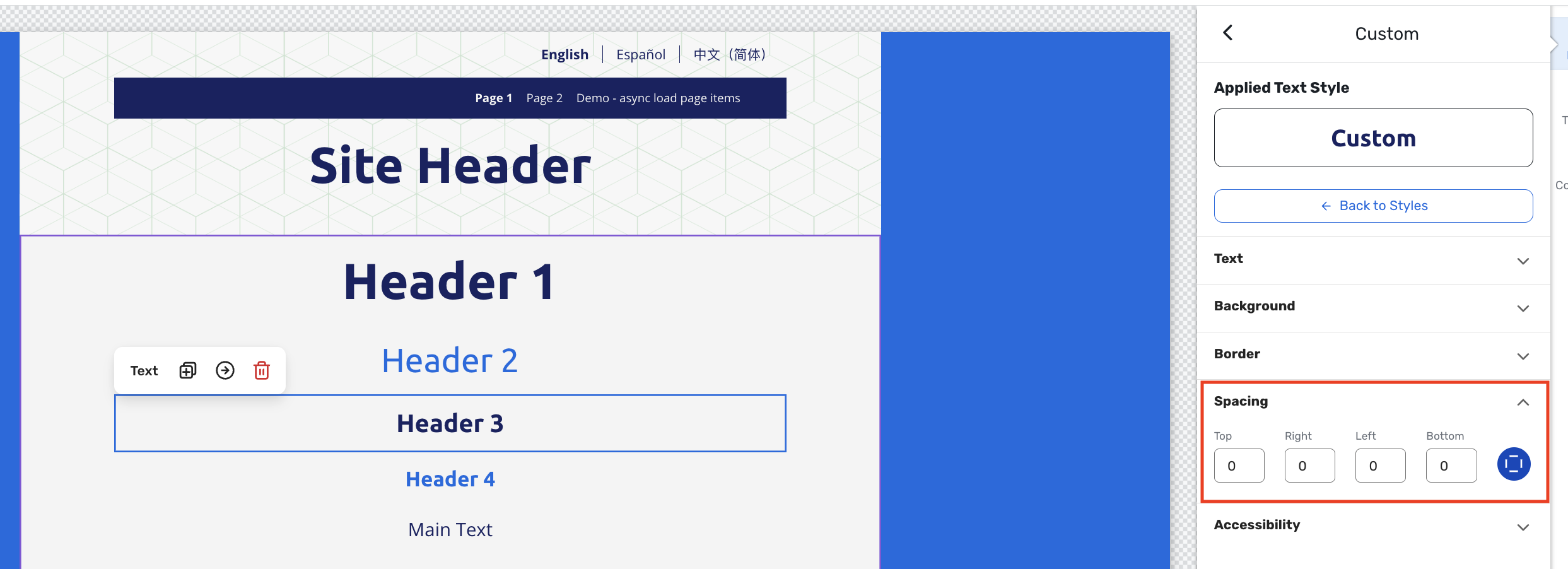
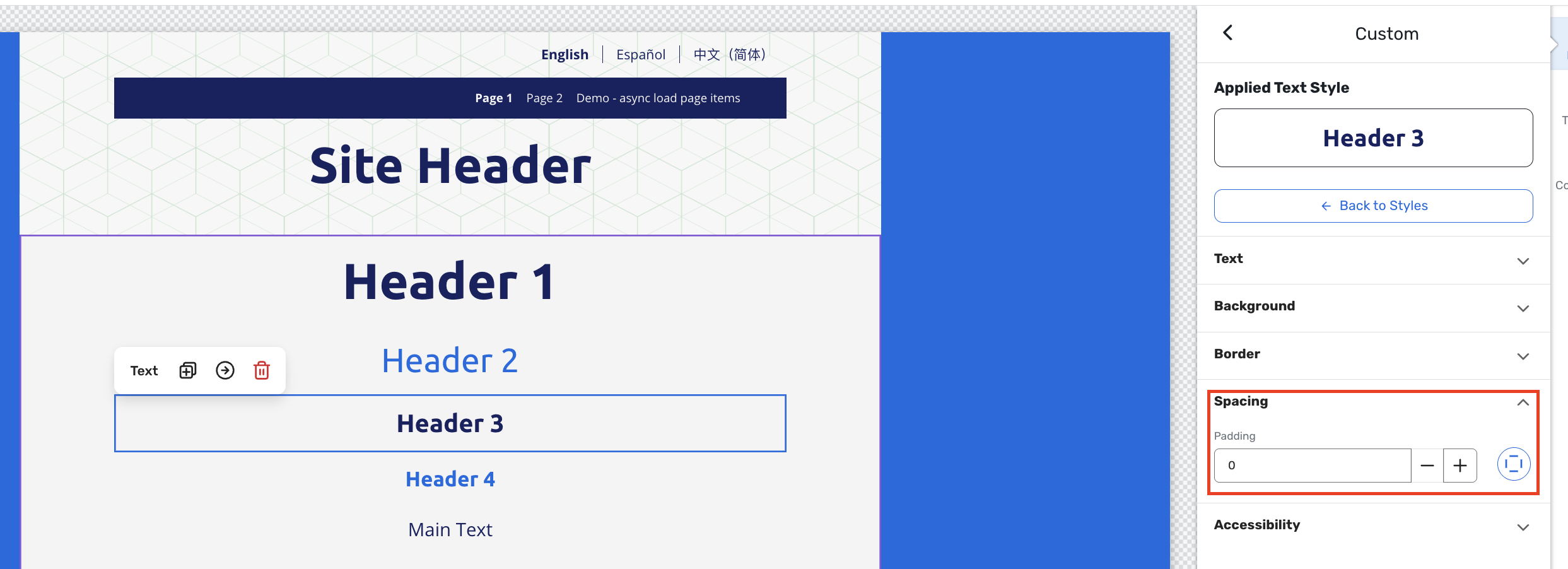
Top, Bottom, Left, Right padding now appear on a single row with numeric inputs (min 0, max 100); all sliders have been removed.
A new group vs individual padding toggle lets planners choose:
Group padding – one value that updates all four sides at once.
Individual padding – separate values for each side, with no cross‑updates.
Existing widgets keep their current behavior (individual vs group) so layouts won’t unexpectedly change.
This makes it much easier to set uniform spacing quickly or fine-tune specific sides when precision matters.
Text & Accessibility
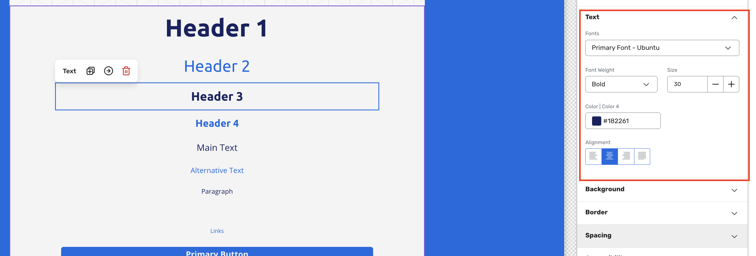
The Text area has been cleaned up to focus on the essentials:
Fonts (renamed from “Font Family”) and Font Weight are kept, with Size now using plus/minus controls (no slider) and clear numeric bounds (0–100).
Color (renamed from “Text Color”) uses the new color picker, aligning text color with other styling controls.
Alignment remains as‑is, preserving familiar behavior.
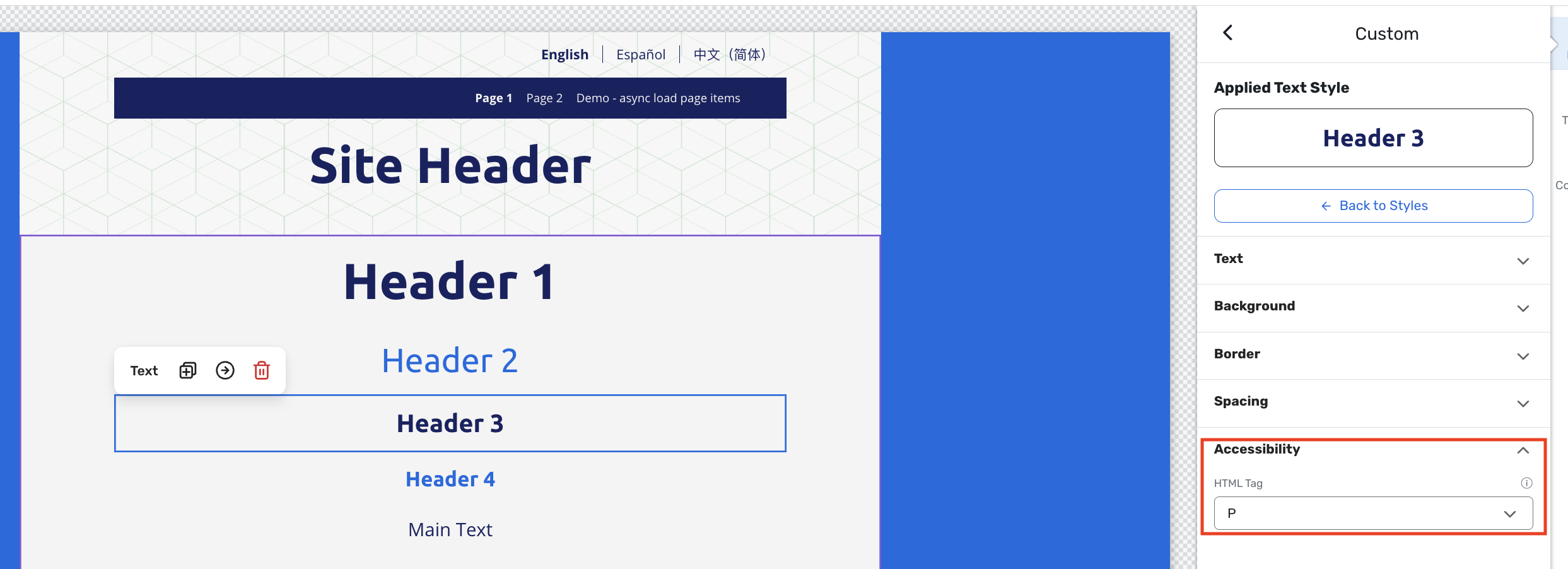
Accessibility settings that previously lived in the widget’s top‑level menu have been moved into the Text section of the Customize panel:
A new Accessibility header groups these options.
The HTML Tag setting (renamed from “HTML Heading Tag”) now lives here, closer to the text style it affects.
REST API: Attendee Optional Items Endpoint
You can now pull a complete list of the optional items (such as merchandise, donations, or add-ons) that any attendee selected during registration, directly through the Cvent REST API. This makes it easier to connect attendee selections to fulfillment, CRM, or reporting tools without manual exports.
Key Things to Know
Attendee optional item selections are now available via the Cvent REST API with no manual export required. You can retrieve selections for any individual attendee using their attendee ID, the same identifier used across other attendee API calls.
Each record includes the item's name, code, and type, along with which event it belongs to. Access requires planner admin authorization, consistent with other attendee data endpoints.
Use Case Examples
Corporate event coordinator After a company-wide conference, a coordinator uses the API to pull each attendee's selected optional items (like T-shirt sizes or meal preferences) and route them directly to the fulfilment team, eliminating a manual download step.
CRM integration manager An integration that syncs registration data to a CRM can now include optional item selections, giving sales and customer success teams a fuller picture of each attendee's registration choices.
Additional Resources
Cvent Community: Questions about the above updates? As always, get answers in the Community via the Open Forum.
Beta Opportunities Page: Try new features and products out before full launch availability. Join Beta Programs.