- STAGE:
- Recently Released

iCapture: Leads & Devices UI Enhancements
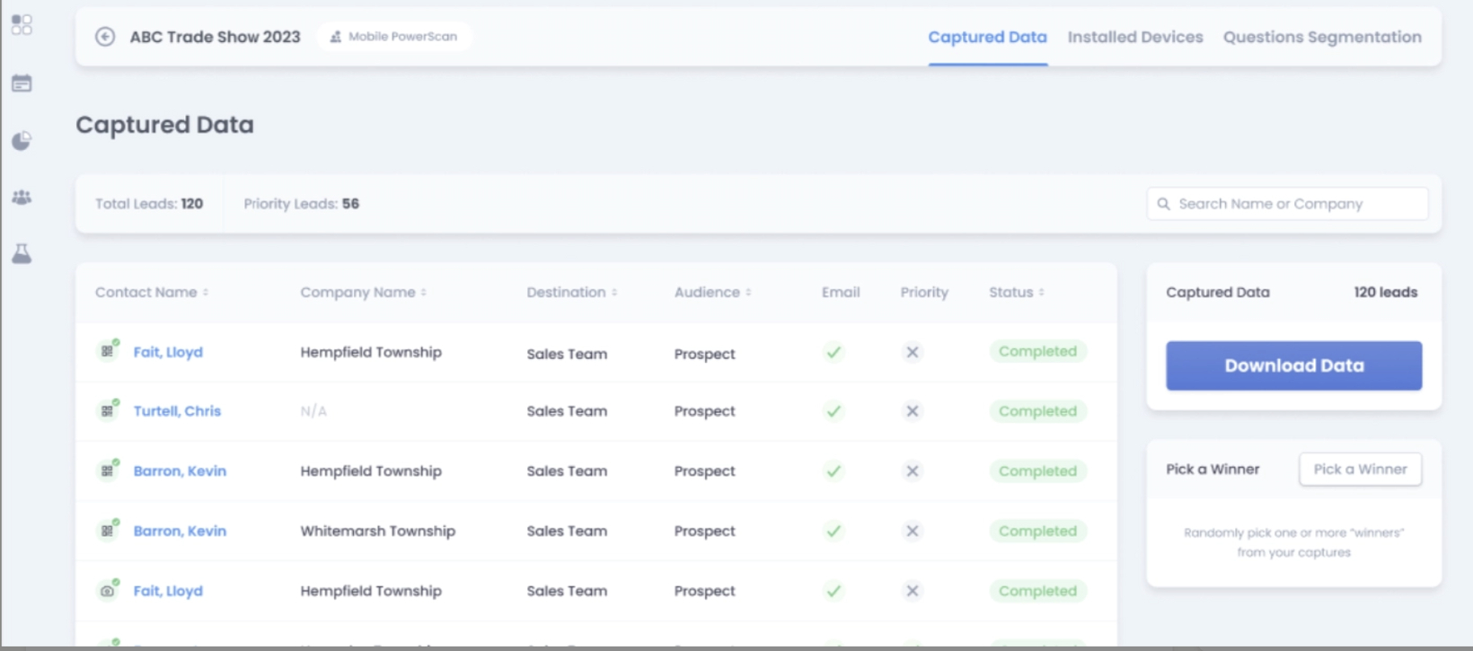
The Leads & Devices pages are receiving a makeover to pull forward the information most relevant to the Event manager and make it easier to: download data, correct missing fields, and manage the event lead data.
Now the Captured Data displays the Destination and Audience of each lead (if those are defined in the client's account) and the lead status is now color coded to make reviewing the leads easier at a glance. Red means errors on Integration, Email Address, or Badge API, Yellow means Incomplete lead data, Blue means Transcription or Post-Show Merge is processing, and Green means a complete capture with no issues.

Also, the Lead Preview Modal is now improved to show more detail on the integration and organize the lead data to be in alignment with the rest of their iCapture experience.

The Devices Page has been improved to look and feel like the rest of the iCapture Back Office experience. The Device data and statuses are now color coded to be easier to understand and manage. Overall, the UI updates are simplifying the User Experience and bringing legacy features into alignment with the rest of the iCapture Product.

Themes: User Centricity, End User Engagement, Effortless Experience